Redesigned Overview Dashboards
Today we’re launching new contact, inventory, and email overviews in Spark. We redesigned each one to create valuable new dashboards for…
Today we’re launching new contact, inventory, and email overviews in Spark. We redesigned each one to create valuable new dashboards for you to work from.
Contact Overview
The contact overview starts with a graph of your registrants and walk-ins over the last 30 days. This gives you a quick snapshot of how active your project has been over the last month. Under the graph we’ve added your project’s total contacts, web registrants and walk-ins. These all link to the corresponding contact lists.
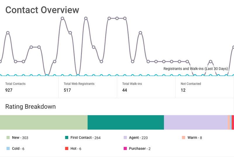
You’ll also see a box with the number of contacts that no one has interacted with. Use this to make sure you’re following up with everyone that registers with your project. Below, the rating breakdown visualizes where your contacts sit in the pipeline. “This Week’s Activity” measures your project’s performance in comparison to the previous week. Your sales team’s average response time is shown to ensure registrants are quickly engaged. The last widget, “My Contacts”, shows the five most recent contacts that are assigned to you. You can interact with them from this page, or click “View All” to access the complete list.
Inventory Overview
Like the contact overview, the inventory overview starts with a graph. This shows total sales over the last six months, giving you a look at when and how well your inventory is selling.
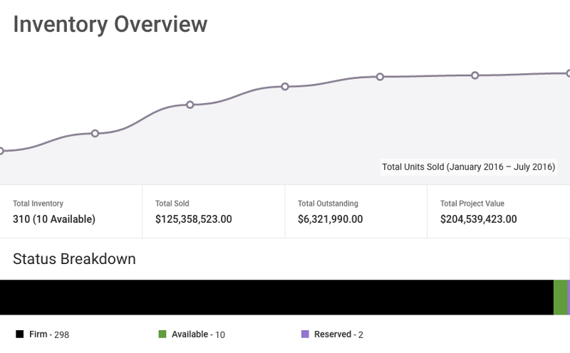
The statistics underneath show the total number of units, value sold, value outstanding, and value of your project. Below that, the new status breakdown shows the current state of your project at a glance. The “Inventory Statistics” widget shows percentage of inventory sold, average unit price and average price square foot. To the right, the “My Inventory” widget shows the five most recent units that you’re assigned to.
Email Overview
If your project sends a lot of email, one of the first things you’ll notice about the new overview is the speed. Rewriting the code behind this overview allowed us to load the data many times faster. The graph at the top of the page shows how many emails you have sent over the past 30 days. This allows you to keep track of how consistently your email campaigns are sent.
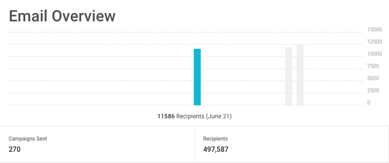
The total number of campaigns and recipients for your project are shown just below the graph. At the bottom of the page, “Recent Campaigns” shows the last five campaigns you have sent. In this list, you will see how many people each campaign was sent to, as well as the open rate. Click through to see more statistics about individual campaigns.

Feel free to email us at support@spark.re with any questions regarding the new features or Spark!