New Product Update: Custom Colours for Analytics
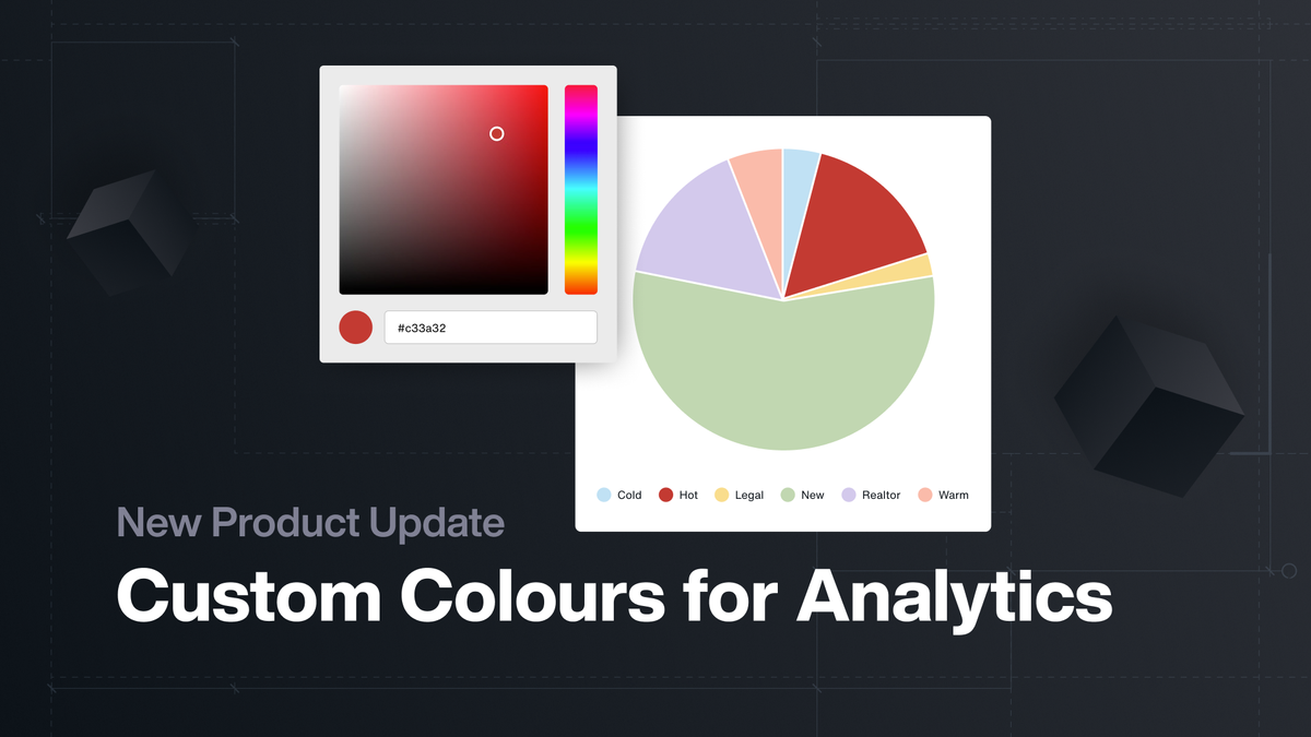
We’ve just released the ability to set custom colours across key fields in Spark Analytics.
Previously, charts and dashboards defaulted to Spark’s system-generated colour palettes. With this update, you can now assign individual colours to specific values in Analytics. That means your charts and dashboards not only look better but also stay consistent across your portfolio.
0:00
/0:16
Here’s what you can customize today in Pie Charts and Bar Graphs:
- Contacts → Ratings, Registration Sources, Marketing Sources
- Inventory → Statuses
- Reservation → Statuses
- Contract → Statuses
- Questions & Answers
- Custom Fields (Dropdown, Checkbox, Radio)
Your settings will carry over across multiple reports, so the same field values will always be displayed with the same colour—no more second-guessing or mismatched charts.
Custom Colours in Analytics is now live for all Spark users — head into your Analytics settings and start customizing today.