Spark Slims Down for Summer
We’re excited to announce Spark is getting a new look!
We’re excited to announce Spark is getting a new look!
We’re excited to announce that Spark is getting a new look! The new layout gives you faster navigation and more space for viewing content. It’s also a major improvement to our mobile experience.
More Space For Content
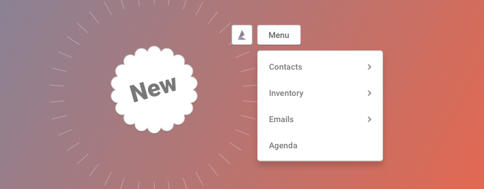
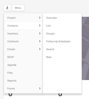
We’ve removed the sidebar from the left of the page, allowing the content to span the full width of your screen. You’ll see new buttons in the header to replace all the functionality of the sidebar. Hover over the Menu button to open up the main menu.
Hover On Desktop, Touch On Mobile
When using Spark on a desktop or laptop computer, hover over the Menu and Settings buttons to open them. If you’re on a phone or a tablet, tap the buttons to open and close the menus.
Access Your Dashboard From Anywhere
We’ve added a new home button in the top left of the page. No matter where you are in Spark, click this button to return to your dashboard.

All Your Settings In One Place
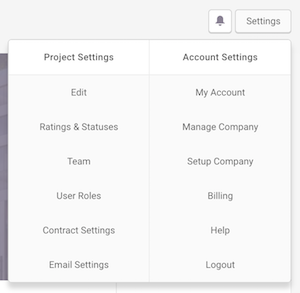
Settings used to be located in both the side bar and under the old account menu. Now you can find everything grouped under the new Settings menu in the top right.
Quick Switching Between Projects
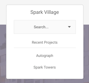
Hover over the project name at the top of the page (tap the name on mobile) to bring up the new project switch menu. Search any of your projects to go to that project’s dashboard. You can also click any of the most recent projects to go to them. Soon you will be able to pin projects here so you always have access to your favourites.
Use Spark On Your Phone or Tablet
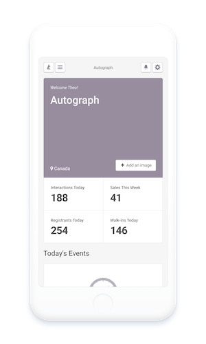
The new design makes Spark even easier to use on the go. The entire website adapts to your screen size. This means that whether you’re in the office on a desktop, at the sales centre with a tablet, or on the move with your smartphone, Spark will always look great.

Feel free to email us at support@spark.re with any questions regarding the new features or Spark!
